Total Return Charts and Drop Analysis
VizWealth's total return charts let you visualize how an investment has actually performed — including dividends reinvested — and dynamically highlight the drawdowns and recoveries that matter most to your clients.
Total Return vs. Price Charts
Unlike a standard price chart, a total return chart reflects what a client actually earned. For example, SPY over a given period might show 79% cumulative growth (15.2% annualized) on a total return basis — a meaningfully different picture than price alone. When you're evaluating a manager or comparing funds, always start with total return.
How Drop Highlighting Works
VizWealth automatically identifies and highlights the largest drawdowns within your selected date range. By default, the chart surfaces the top four drops, showing:
- The starting value before the decline
- The trough value and percentage lost
- The recovery date and time to break even
- The subsequent growth from that point
You can customize this in two ways:
By number of drops — Type a number into the drop count field to display the top N drawdowns. Switching from four to five or six drops instantly updates the chart.
By threshold percentage — Use the chart options to show all drops greater than a specific percentage. Set a 4% threshold to see every meaningful correction, or tighten it to 3% to cast a wider net. VizWealth finds and highlights each qualifying drawdown along with its recovery curve.
Adjusting the Date Range
In the chart options panel, you can set a custom date range by entering a full date or just a year. Analyzing a short time frame isolates a specific market environment. Pulling back to a long time frame reveals how the same investment behaved across multiple cycles. Looking at both gives clients a more complete picture than either view alone.
Comparing Investments During Stress Periods
The most practical use of drop analysis is side-by-side comparison during a shared drawdown. Enter multiple tickers in the ticker box, click Align Charts, and VizWealth overlays their performance across the same period with drop and recovery annotations on each.
Example: SPY vs. QQQ
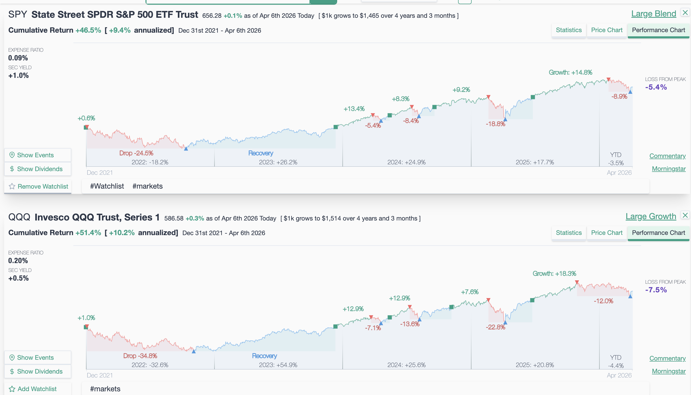
The chart above compares SPY (S&P 500, Large Blend) and QQQ (NASDAQ 100, Large Growth) from December 2021 to April 2026. Key observations:
- SPY: cumulative return +46.5% (+9.4% annualized), worst drop −24.5% in 2022, recovered in 2023, currently −5.4% from peak
- QQQ: cumulative return +51.4% (+10.2% annualized), worst drop −34.8% in 2022, recovered in 2023, currently −7.5% from peak
QQQ's higher total return came with a significantly deeper drawdown — 34.8% vs 24.5%. A client who bought QQQ at its 2021 peak spent all of 2023 just recovering losses before making money. This is exactly the conversation that VizWealth's drop analysis is designed to facilitate: not just which investment returned more, but whether the extra return was worth the extra risk.